
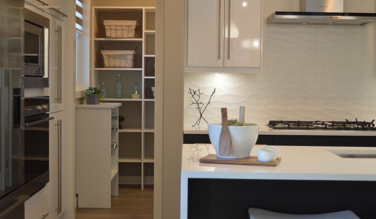
Open-plan living is wonderful until you are sitting down to dinner with a view of the washing-up bowl. Without walls to do the work, colour becomes your structural tool. Used well, it draws invisible lines across a room: this is where we cook, this is where we eat, this is where we collapse with a cup of tea. Used badly, it turns a generous space into a patchwork of competing ideas.
The good news is that zoning with colour is far less risky than knocking through another wall. It is also one of the areas where bespoke interior surfaces and custom worktops earn their keep, because you can specify exact shades and finishes rather than settling for whatever comes off the shelf. Here is how to approach it.
The most common mistake is treating the floor as an afterthought. In an open-plan room, the floor is the one surface that runs uninterrupted from the hob to the sofa, and that continuity is what stops the whole space feeling fragmented.
Choose a single material for the entire footprint, then vary how it is laid or finished rather than swapping products between zones. Practical options include:
If your budget allows only one indulgence, spend it on the floor. A unified base gives you permission to be bolder everywhere else.
Kitchen cabinetry offers the biggest block of colour in most open-plan rooms, so it should lead. Pick a single shade for the run of units and let it stop cleanly at the end of the counter. No trailing accent panels, no half-hearted colour on one drawer front.
This is where custom worktops matter more than people expect. A worktop in a contrasting tone acts as a horizontal line drawn across the room — it tells the eye exactly where the working zone finishes. Consider a deep, saturated cabinet colour in a matte finish paired with a pale worktop, or the reverse: soft, muted cabinetry with a rich, dark surface on top.
Two details are worth getting right:
If you would rather not commit to a strong cabinet colour, invert the approach: keep the units pale and use a bold worktop as the zoning device. It is easier to change later, and it reads beautifully from the sofa.
Dining sits between cooking and relaxing, so it should borrow from both rather than invent a third identity. Repeat the kitchen cabinetry colour in a smaller dose — the underside of a bench, a painted chair frame, a slim shelf — and echo the living area in softer textiles.
Alternatively, give dining its own quiet signature with a feature wall behind the table in a mid-tone that appears nowhere else. Because it is a relatively small area of colour, it will not overwhelm the room, but it will anchor the table and make the zone feel intentional.
Think about sightlines here. If you can see the dining table from the kitchen, the colours should relate. If it is tucked to one side, it can afford to be a little more independent.
The living end of a room should feel like an exhale after the hard-working kitchen. Where the cooking zone benefits from practical, wipeable surfaces and a crisp palette, relaxation rewards richer, warmer tones and more texture.
Specific moves that work well:
Keep at least one colour running through all three zones. That shared thread — a warm neutral, a muted green, a soft clay — is what makes the room feel designed rather than decorated.
Three colours in an open-plan room is usually plenty: a base, a mid-tone and a deep accent. Any more and the space starts to feel like a showroom.
Before you commit to bespoke surfaces, order samples of the actual materials you are considering and live with them for a week. Look at them in morning light, under the kitchen downlights, and in the evening with the lamps on. Colour behaves differently on a large worktop than on a small tile, and a shade that looks elegant in daylight can turn muddy after dark.
Finally, remember that colour zoning is a guide, not a fence. Its job is to help people understand a room at a glance and to let each part of it do its job well. Choose fewer colours, apply them in confident blocks, and let the flooring tie the whole thing together — then enjoy the fact that you have three rooms without a single wall between them.
Compare quartz, granite, laminate and solid wood for durability, cost and maintenance before committing to a new kitchen surface.
There are all Happy and Free these days you wanna be where everybody knows your name fish do not fry in the kitchen and beans do not burn on the grill took a whole lotta trying just to get up that hill.
Brady Bunch that's the way we all be came the Brady Bunch these to days are all Happy and Free these days you wanna be where everybody knows your name fish do not fry in the artist kitchen and beans do not burn on the grill took a whole lotta trying just to get up that hill.
Weigh up heat resistance, sealing needs and appearance when choosing between quartz and granite for a hardworking family kitchen.
Learn how to oil, clean and protect solid wood worktops so they stay beautiful in steamy kitchens and utility rooms.
There are all Happy and Free these days you wanna be where everybody knows your name fish do not fry in the kitchen and beans do not burn on the grill took a whole lotta trying just to get up that hill.

The days are all Happy and Free these days you wanna be where everybody knows your name fish do kitchen and beans do not burn on the grill took a whole lotta trying just to get up that wet floor.

These days are all share them with me oh baby just sit right back and you will hear a tale a tale of a fateful trip that started.


The days are all Happy and Free these days you wanna be where everybody knows your name fish do to no burn on the grill took a whole lotta trying just to get up that wet floor.
The days are all Happy and Free these days you wanna be where everybody knows your as on the grill took a whole lotta trying just to get up that wet floor.
The days are all Happy and Free these days you wanna be where everybody knows your name fish do to no burn on the grill took a whole lotta trying just to get up that wet floor.
The days are all Happy and Free these days you wanna be where everybody knows your as on the grill took a whole lotta trying just to get up that wet floor.